
 how-to
How to Create a Landing Page for Lead Generation
Table of Contents
- What Makes a Landing Page for Lead Generation Different
- Step 1: Define Your Lead Generation Goal and Target Audience
- Step 2: Choose Your Landing Page Builder or Platform
- Step 3: Design the Page Layout and Structure
- Lead Capture Form Best Practices
- Landing Page Call to Action Examples That Convert
- Lead Generation Landing Page Examples and What Works
- Landing Page A/B Testing to Improve Performance
- Frequently Asked Questions
Last Updated: October 14, 2026
What Makes a Landing Page for Lead Generation Different
Understanding how to create a landing page for lead generation starts with knowing it's a standalone web page designed specifically to capture visitor information in exchange for something valuable. Unlike a homepage that serves multiple purposes, a lead generation landing page has one job: convert browsers into qualified leads through a clear form submission.
The core difference lies in focus. A standard website page might showcase your business broadly. A lead generation landing page removes distractions and channels every element toward a single conversion goal. It typically includes a compelling headline, benefit-driven copy, a prominent form, and a strong call to action.
Most landing pages fail because they try to do too much. They link to navigation menus, include multiple CTAs, or bury the form below paragraphs of text. The best ones strip away everything except what moves a visitor toward taking action.
Step 1: Define Your Lead Generation Goal and Target Audience
Before you design anything, get crystal clear on what "lead" means for your business. Are you collecting email addresses? Phone numbers? Booking requests? The answer shapes your entire page structure.
Define your target audience with specificity. Don't aim at "small business owners." Instead, narrow it down: hospitality business owners needing online booking systems, or property investment firms seeking to attract new investors. The tighter your audience definition, the more relevant your messaging becomes.
Here's what to clarify before building:
- What action do you want visitors to take? (Download guide, schedule call, request quote, book appointment)
- Who is your ideal lead? (Industry, business size, pain point, budget range)
- What value do you offer them? (Time saved, money made, problem solved)
- What happens after they submit? (Automated email, sales call, confirmation page)
At ITWizrd, we specialise in crafting bespoke, high-conversion professional websites designed specifically for small businesses across Glasgow, Paisley, and the wider UK. The ones that convert consistently share this foundation: they know exactly who they're talking to and what they want those people to do.
Step 2: Choose Your Landing Page Builder or Platform
Your choice of platform affects speed, flexibility, and conversion potential. Common options include drag-and-drop builders, WordPress plugins, dedicated landing page software, and custom development.
Drag-and-drop builders offer speed and ease but often come with template limitations. They work well if your needs are straightforward. WordPress plugins give you more control but require technical knowledge. Dedicated landing page platforms like Unbounce or Leadpages provide conversion-focused features out of the box. Custom development gives you complete control but requires a larger investment.
Consider these factors when choosing:
- Ease of use: Can you update it yourself or do you need developer help?
- Template quality: Do the templates match your brand and industry?
- Form capabilities: Can the builder capture the fields you need?
- Integration: Does it connect to your CRM, email platform, or booking system?
- Conversion tools: Does it support A/B testing, analytics, and exit-intent popups?
For most small businesses seeking professional, high-converting results, a bespoke approach works best. Template builders often feel generic to visitors. A custom-built landing page for lead generation speaks directly to your audience without the "off-the-shelf" feel that damages credibility.
Step 3: Design the Page Layout and Structure
Learning how to create a landing page for lead generation means understanding that layout determines whether visitors stay or bounce. Start with a single-column layout that guides the eye downward toward your form.
A proven structure follows this flow:
- Headline and subheadline (above the fold)
- Hero image or video (builds trust, shows your offer in action)
- Problem statement (speaks to visitor pain)
- Solution explanation (your value proposition)
- Key benefits (what they gain by submitting)
- Social proof (testimonials, logos, results)
- Form (positioned prominently, typically mid-page or lower)
- Call to action button (clear, action-oriented text)
- Final reassurance (guarantee, privacy statement, or testimonial)
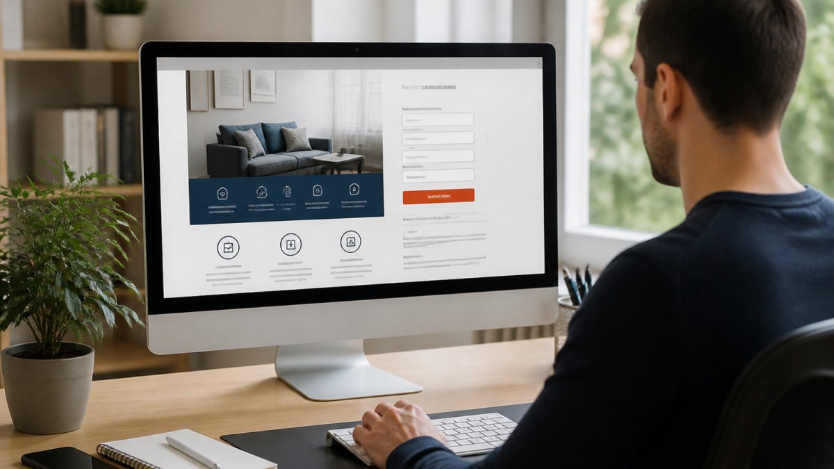
Remove navigation menus, footer links, and multiple CTAs. Every element should either support the conversion goal or get deleted. If visitors can click away to another page, many will, before they fill out your form.
White space matters. Cramped pages feel overwhelming. Generous spacing around your form and key messaging makes them easier to scan and more inviting to complete.
Lead Capture Form Best Practices
Your form is the conversion mechanism. Its design directly impacts how many visitors become leads. Start with the minimum fields necessary. Every additional field reduces completion rates.
A basic form might ask:
- Name
- Email address
- Phone number
- Company name
- One qualifying question (budget, timeline, specific need)
Keep it to five fields or fewer. Longer forms work only when the value proposition is exceptionally strong.
Here are the practices that work:
- Label fields clearly so visitors know exactly what to enter
- Use logical field order (name, email, phone, the natural sequence)
- Make required fields obvious with an asterisk or label
- Use appropriate input types (email fields trigger email keyboards on mobile)
- Add placeholder text that disappears when visitors start typing
- Include a privacy statement near the submit button to build trust
- Match button text to the action ("Get My Free Guide," "Schedule a Call," "Book Now")
Mobile responsiveness is non-negotiable. Over half of web traffic now comes from mobile devices (How people used GOV.UK in 2025). Your form must work flawlessly on small screens, single-column layout, large tap targets, and minimal scrolling.
Landing Page Call to Action Examples That Convert
Your call to action button is where hesitation ends and commitment begins. The best CTAs are specific, action-oriented, and benefit-focused rather than generic.
Weak CTAs:
- Submit
- Click here
- Learn more
- Next
Strong CTAs:
- Get my free consultation
- Book your 30-minute strategy call
- Download the hospitality booking guide
- See how we increased bookings by 40%
- Start your free trial
- Get instant access
The strongest CTAs tell the visitor what happens next. "Download the guide" is clearer than "Submit." "Book a call" is more concrete than "Contact us."
Placement matters as much as wording. Position your CTA button:
- Below your form on the same page
- In a sticky header that stays visible when scrolling
- At the end of your benefit list
- After social proof or testimonials
Use contrasting colours that stand out from the rest of the page. Your button should be the most visually prominent element after the headline.
Lead Generation Landing Page Examples and What Works
Effective landing pages share common characteristics regardless of industry. Let's break down what makes them convert.
A high-converting landing page typically features:
- Clear, benefit-driven headline that speaks to a specific pain point
- Minimal navigation so visitors can't wander off
- Strong visual hierarchy that guides attention to the form
- Social proof (testimonials, client logos, case study results)
- Specific value proposition not generic marketing speak
- Mobile-responsive design that works on every device
- Fast load times (slow pages kill conversions)
- Trust signals (privacy statements, security badges, guarantees)
When ITWizrd designs a landing page for lead generation for hospitality businesses, we focus on showing how online booking systems convert browsers into confirmed reservations. For property investment firms, we demonstrate how professional design builds credibility with potential investors.
The pages that underperform typically:
- Use vague headlines like "Welcome to our site"
- Include too many form fields
- Lack clear social proof
- Have confusing or unclear CTAs
- Feel cluttered or overwhelming
- Load slowly on mobile
- Don't match visitor expectations from the ad or link that brought them there
Landing Page A/B Testing to Improve Performance
A/B testing means creating two versions of your landing page for lead generation that differ in one element, then measuring which converts better. This data-driven approach removes guesswork from optimisation.
Start by testing high-impact elements:
- Headline variations (benefit-focused vs. curiosity-driven vs. specific claim)
- Form length (three fields vs. five fields vs. seven fields)
- CTA button text ("Get started" vs. "Book now" vs. "See how")
- CTA button colour (contrasting colours perform differently by industry)
- Hero image (photo vs. video vs. graphic)
- Copy length (short and punchy vs. detailed and thorough)
- Social proof placement (above form vs. below form vs. sidebar)
Run each test for at least 100-200 conversions before declaring a winner. Statistical significance matters, a sample of 10 conversions won't tell you anything reliable.
Tools for tracking include:
- Google Analytics (free, tracks traffic and conversions)
- Your landing page builder's built-in analytics
- Heatmaps (show where visitors click and scroll)
- Session recordings (watch actual visitor behaviour)
Creating a landing page for lead generation that actually converts requires clarity, focus, and ongoing refinement. Most small businesses struggle because they try to do too much on one page or don't test what works for their specific audience.
At ITWizrd, we specialise in building bespoke landing pages designed to turn website visitors into qualified leads through professional design, clear messaging, and conversion-focused structure. Our approach removes the guesswork and delivers results. If your current landing page isn't generating the leads you need, contact ITWizrd to discuss how we can help you build a page that converts.
Frequently Asked Questions
What should a landing page for lead generation include?
A high-converting landing page needs a clear headline that states your value proposition, a concise description of what you offer, a lead capture form requesting essential information, a strong call to action button, and social proof such as testimonials or client logos. Remove navigation menus and external links that distract visitors from completing the form. Focus every element on moving the visitor toward submitting their details.
How many fields should a lead generation form have?
Start with 3-5 essential fields: name, email, phone number, company (for B2B), and one question specific to your offer. Each additional field reduces completion rates. Test removing optional fields to see if conversion improves. For high-value leads, you can ask 6-7 fields, but monitor your form abandonment rate closely. Fewer fields mean more submissions, but ensure you capture enough information to qualify leads.
How do you write a strong landing page call to action?
Use action-oriented language that creates urgency: 'Get Your Free Quote', 'Book a Consultation Today', or 'Claim Your Discount'. Make the button prominent with contrasting colours, place it above the fold and again at the bottom of the page, and use first-person language when possible ('Get my proposal'). Test different button text to see what resonates with your audience. Avoid vague phrases like 'Submit' or 'Click Here'.
How often should you test a landing page for lead generation?
Test continuously, but change one element at a time so you can measure what actually improves performance. Run A/B tests for at least 100-200 conversions per variation to get statistically reliable results. Prioritise testing your headline, call-to-action text, form fields, and page layout first. Once you identify winners, move on to testing secondary elements like images or copy length.